


not that you're obligated to like them. but if you do, perhaps you'd like to tell me your favorite aspects?
first up, the delicious chicago apartment of lauren gold, design director for nate berkus associates


images via lonny magazine, photos by patrick cline
the past few issues have featured this glam look with metallics and black and warm whites, and i'm completely okay with it. favorite parts: the blackout open shelving, that sic chrome lamp, the mixed metals and that dining table
paired with those chairs (duh).
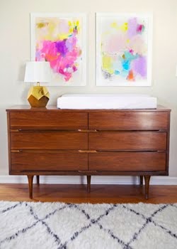
and then there's ruthie sommers' living room. i died a thousand times when i saw this spread.


ruthie sommers in lonny magazine, photos by patrick cline
i really can't handle the sheer genius of this place. i've come to hate the overused term "eclectic" in the last few years, but this living room is style-that-shall-not-be-named done exactly right. it's pecuuuuuliar, and i couldn't be more in love. i love that every element is amazing on it's own, but that they can all live in such harmony. chaotic harmony. which is my MO, so i approve >>>>>>>>> do you?


5 comments:
It's just absolute perfection in my book- the first shot especially- just adore it!!!
LOVEEEE! The combo of gold and black in the first rooms is amazing and so luxurious! Very classy but trendy and sophisticated - so my kind of style :) You have definitely inspired me!
-Linh
Lauren Gold's dining table has me piiiiining for a wheat-sheath side table!! Got your print today--it's beautiful! Wanna do the calligraphy for my wedding someday (i'm not even engaged ;)?!?
Ha, I posted a few shots from Lonny today too, but different rooms! I'm really really into the black/white/gold/chrome mixed with that wash of gray/blue. Totally my M.O. (at least for the moment)!
haha! sign me up, Meghan :)
Post a Comment