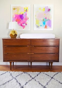
you guys. if you haven't seen nick olsen's spread in the latest issue of veranda, you need to run to your nearest newsstand.
do not pass go. do not collect $200.
i spooned my copy last night.
a peek at what i'm talking about:
interiors by nick olsen as seen in veranda magazine // photography by melanie acevedo
also, nick, get on it with a portfolio site, will you? i need an easier way to stalk your work.


16 comments:
I love all of the little details!
Ugh, he is so effin' amazing. I agree wit you about the portfolio on a site thing. Seriously, it makes stalking so much easier!
I grabbed mine last night at the grocery store. Lapped it up. Very reminiscent of his mentor, Miles, no?
Just got my copy yesterday and slept with it last night (literally). Just blogged about it myself. Love it for so many reasons!
www.chattafabulous.blogspot.com
GORGEOUS.
Realizing I use that word too much, but seriously, in this case, there's no other word.
i thought it was gorgeous. but it looks like miles redd decorated it. which isn't a bad thing bc MR is a genius but something about it screamed copycat to me.
Miles sure isn't a bad person to conjure up. And I'm kind of in love with those chevron floors.
"... but it looks like miles redd decorated it."--MFAMB.
No, it really doesn't.
thanks for keeping it friendly around here, anon.
My pleasure. I notice that whenever Nick Olsen publishes anything, people automatically say they see Miles' work in it. But this is more restrained and differently edited. It feels distinct.
LOVE EVERYTHING!!! I would kill for that side table and window treatments in the first pic!!!
Ha, you're hilarious. I regularly fall asleep with my laptop in bed- not normal. I'm kinda dying over the intricate wicker basket in the cover shot. Could there be chicer way to store magazines? I think not.
I am in love with Nick Olsen and his designs. He is so good...and I agree a superstar. His rooms are young, fresh, current. I must pick this up.
He is the mix master! So many wonderful elements all playing happily side-by-side. I love the traditional foundation that does not at all feel dated. Just a beautiful, livable, lovely home!
I may be in love with Nick Olsen, Weird? I'm OK with it.
Yep. I want to live there. Badly! The mixing..it's brilliant! xo, Jolie
Post a Comment