One Room Challenge // Master Bedroom Final Reveal

November 5, 2014


Well, my friends, it's final reveal day. Collective sigh of relief! What started off as a relatively stress-free six week makeover became significantly anxiety inducing in the eleventh hour due to a small lighting fiasco.

But let's start at the beginning. I set out exactly six weeks ago to make over this neglected space:


Cringe.

I wanted the new space to be fresh, bright and comfortable with a feminine/masculine balance. A colorful vintage Serapi rug was the perfect starting point. I was going for something like this:


Then I came across the most unbelieveable brass Sarreid chest you ever did see, which changed up the nightstand situation. Anyone who knows me will tell you that I love me some one-of-a-kind vintage items -- especially when they're brass! And I opted out of an Ikea hack to save time and sanity. Which brought us to something more like this:


Which was great until I received the wrong sconces not once but TWICE within a week of the deadline. And put off new art selections a wee bit too long, which meant pulling pieces from other parts of the house. With very little time to order a new affordable lighting option online, I defaulted to my favorite source, Kansas City's West Bottoms, in hopes of finding a suitable substitute. When I happened upon a massive Tole wall sconce, I knew I had my answer. A few coats of matte black paint keeps the room from going too fem and a little rewiring by the hubs gives us easy control from a remote. Gorgeous AND functional! Me likey.

Now I must warn you that I am eating my words a little bit with this final reveal. I promised unstyled and lived in. Which you are getting with no-frills bedding and a barrister that needs a serious dusting. But the Kleenex made it into a fabulous Afghan box instead of sitting out entirely. And there are actual flowers on the nightstand. (Fancy!) Without further ado, our new master bedroom:


all photos courtesy of Jane K Photo


SOURCE LIST
wall color Valspar Modern Gray // bed Nail Button Tufted Wingback in charcoal // bedding Calvin Klein in white // striped throw Happy Habitat // vintage Tole 9-arm sconce painted Rust-oleum Camouflage in ultra flat black // vintage brass Sarreid chest // vintage painting on brass chest // vintage Serapi rug // bench upholstered in Ballard Designs Dodie // Saarinen-style side table LampsPlus // alarm clock Soundfreaq // magazine basket HomeGoods

vintage barrister bookcase // starburst mirror (similar) // barrister white lamp Crate & Barrel // vintage brass floor mirror // vintage rattan stool used as plant stand // lips painting on top shelf Meg Biram original art

white Malm 6-drawer chest // brass drawers pulls Etsy // dresser lamp Target

figure art my own // limited edition letterpress print Hammerpress // gazelle horns High Street Market // metallic constellation print Amber Goodvin // original leopard watercolor print The Aestate // You're The Best And The Mostest print Read Between The Lines // stripes Rebecca Atwood original art

Definitely keep an eye on my shop 200Main for similar vintage goods! We're constantly listing fabulous new treasures.

Countless thanks to the brave Linda of Calling It Home for tapping me to participate a second time, and for coordinating flawlessly. Thank you to Lamps Plus, Happy Habitat, Read Between the Lines and Soundfreaq for your extraordinary generosity in the way of donated items. Big wet kisses to my patient husband and mom for helping me along the way. I would still be sitting amidst Ikea dresser components lightingless (I just made that a word) without you. Big ups to co-worker and photog extraordinaire Jane K Photo. And, as always, thank you to each and every one of you that has followed along here and via Instagram. Your kind comments, encouragement and advice are unmatched. I am so blessed to be part of such a powerful community. oxox

And now it's time to go forth and feast your eyes on 19 other top notch spaces created by these incredibly talented ladies. Please make sure to tell them how much you appreciate their hard work and inspiration while you're there. Because we bloggers are nothing without your comments and encouragement. It's like crack. There is also a linking event via Calling It Home that goes up tomorrow with even more ridiculously inspiring spaces so be sure to check that out, too.


Trademarked by Calling it Home

One Room Challenge // Week 5

October 29, 2014

Oh man, you guys. Before we get into One Room Challengeness, can I just say ROYALLLLLLSSSSSSSSS!!!! Our city is blanketed in blue right now. All blue everything! It's amazing.

Moving on.

Down to week 5 of the challenge.

To recap:
Catch up with the starting point for my master bedroom in week one.
Peep rug, paint color and Ikea dresser inspiration in week two.
See the adjusted plan with a great vintage score in week three.
And peruse lighting, fabric and hardware options in week four.

I was expecting a relatively drama free week five report. And then this arrived.


Quite nice, but that is not a sconce. Which, hey, wrong item. You return it and get your new goods and all is well. Except that it's preeeeeetty late in the game and I must remind you that they only had white sconces in stock. So they need to be painted black and installed before this weekend's photo shoot. Here's hoping the situation has actually been rectified and I get what I ordered this time or I'm in trouble.

In other news, I did get the correct bench fabric and dresser hardware.


Went with the Dodie fabric from Ballard Designs and I. Am. In. Love. I want to reupholster all of the things! Also quite smitten with the hardware results. They're smaller than they were in my head (despite measuring), but that's probably good. You can find all of my favorite hardware options here.

A little sneaky peek of said hardware on the sassy white Malm Ikea dresser:


Ava clearly approves. Definitely no pinched baby digits in our future.

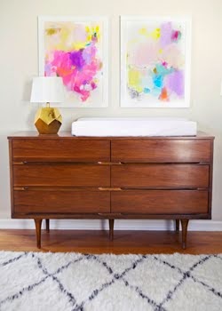
There are still art decisions being made. Originally, I wanted a pretty tight neutral palette so the rug would really sing. (I always love the look of this when I see it elsewhere. Very chic.) But then I came across this special treat over the weekend and I couldn't resist. The palette really complements the colors in the rug, so I'm thinking it could possibly live in our room.


Hard to pass up, right? Neutral with one exception? Pretty sure I will make the call about 10 minutes before the photographer shows up.

I think that's all I have for you guys. I know we originally discussed giving the shoe barrister a makeover, but it was my late grandfather's and I just can't bear to make any changes. Had it been a miscellaneous find, I would be all over it, but I can't bring myself to do it.

Bringing the big guns next week. Hope you guys come back for the big reveal! Thanks for all of the kind comments, support and valuable feedback up to this point. It really makes all the difference.

Time to visit our friends:

Trademarked by Calling it Home

Home Feature in KC Magazine

October 23, 2014

I'm not sure why I feel so sheepish about sharing this. I've been saying for years that one of the items on my bucket list is to have my home published. And, well, I'm excited to say that I actually get to check this one off the list! If you're new to Because It's Awesome, the article, written by Kelsey Cipolla, will give you some background on myself and my design philosophy. And if you've been around for awhile, you finally get a peek into my home.


I'm so honored to be featured in this month's fall fashion issue of KC Magazine. Look! I even did my hair.


I haven't been able to track down a physical copy just yet, but the digital version is available here. I share a spread with local sweethearts Melanie of Style Scout and Kat of GoBlogSocial, and that is a pretty big compliment. You can find the full feature on page 92 of the digital version.


Huge thanks to the fine folks at KC Magazine for tapping me. It's such a thrill! (Click through to see more of my home.)


One Room Challenge // Week 4

October 22, 2014


I feel like today's post should be titled "nothing to see here." Which I know is not a solid way to start a post, but it's kind of the truth. If you're just joining us, you might want to peruse week 1, week 2 and week 3 for a thorough history of where we've been with my master bedroom redo.

For me, week 4 tends to be when things start to fall into place (but you can't show things in place because it gives it all away). It's also the week that you start to freak out over the ambitious list of things you haven't tackled yet (or recently ordered and must now pray for their timely arrival).

There's a term for the latter...It's...Wait...Oh, right. Procrastination.

Which should have been my middle name. But I guess Gwendelyn sounded better.

What do I actually have for you this week? Well, most of the furniture is in place. This ensures that the room is good and lived in before you see it. Because I like these challenges best when it looks like someone could actually use the room.

Outstanding elements from last week:

I considered a LOT of fabrics for the bench at the end of the bed. Animal print definitely reigned supreme with its timelessness and ability to act as a solid. Can't wait to get my final choice! Can you guess which one I went with?

I had a lot of black lighting options to choose from as well.

1 // 2 // 3 // 4 // 5 // 6 // 7 // 8

Truthfully, this one had me a little deflated as my favorites were well out of my budget. Reader to the rescue! Thank you, Anonymous (words no blogger ever expects to say), for your suggestion! I had to order them in white, which I'll give a chance just for fun. But they're probably getting painted matte black as discussed last week.

Art has been another slow process for me. Most of my choices are getting vetoed by the other party that shares this room. I want both of us to love what we wake up to every morning, so this may just be a matter of rearranging pieces we already have in the house in the interest of meeting the 6 week deadline. Verdict is still out.

I mentioned last week that I was narrowing hardware choices to customize our sleek new white Malm dresser. Well it's now been selected but I'm still not revealing the final choice just yet. If you follow on Instagram, you'll probably get a sneak peek because I'm guessing that I won't be able to contain myself when that box finally arrives! Here are a few of my faves, which you've likely seen ad nauseum on Pinterest. But they're just that good.

1 // 2 // 3 // 4 // 5 // 6 // 7 // 8 // 9 // 10 // 11

Tough decision, right? I basically had to close my eyes and point.

And now it's time for the best part of my day!
Who's doing a better job of procrastinating than me?


Trademarked by Calling it Home

One Room Challenge // Week 3

October 15, 2014

Hello and welcome back to the One Room Challenge! It's week 3, which means we are HALFWAY THROUGH. Bananas. Also, holycrapistillhavealotofdecisionstomake.

To recap in case you're just now joining us: In week 1, we took a look at the starting point for my master bedroom and established a loose plan. You can see that here.

I hate planning ahead. I'm terrible at it.
So when this Sarreid chest showed up in my garage while I was out of town


my plan immediately changed. Because, if you don't already know this about me, I looooooove me some brass in a people-worry-about-me kind of way.

In week 2, we took a look at the rug I chose for the space, narrowed wall color choices to 8 shades of gray, discussed Ikea dresser hack inspiration, and decided on the mismatched bedside tables.

Which brings us to week 3. I could say that I'm very impressionable (and I am), but I was quite literally willing you guys to agree that the room couldn't do without the Sarreid/Saarinen combo. So thank you. I ordered the sexy Astrid Marble White Side Table from ORC sponsor Lamps Plus (thank you, Lamps Plus!!!) and it arrived yesterday. I don't have everything in place, so I can't say for sure that it's the perfect combo....but it is. We all know it is.

Here's the evolution of the room thus far:

I went with Modern Gray on the walls. It's a soothing, barely there gray and I'm really happy with it. Grays are haaaaaaaaaaaard. Finding the right shade takes a great deal of patience and $8358476849 in samples. Here's a peek at the transformation:


Never was able to snap an after photo with good light, but trust that it's purty.

As you can see above, I've opted to skip the painted Ikea hack because I just don't have the strength. (And by "I don't have the strength," I mean my husband doesn't have the time.) But he did have time to decipher Ikea's instructions, so he got to work constructing the Malm 6-drawer dresser and it's looking good!

God bless husbands. Especially mine.

We'll give the dresser a little je ne sais quoi with stylish brass pulls. I'm still collecting options, so let's break that down next week, m'kay?

Since the bedside tables are different sizes and heights, I'm leaning towards sconces instead of lamps. I love the idea of matte black because it's sexy as hell and adds a masculine touch to the space. Something like zees:


Because yes, Christine, YES.


Elizabeth Cooper as seen in Lonny Magazine

Of course, with a minimal budget, this may mean finding the right shape and spray painting them myself. A girl's gotta eat, you know.

Also, I was able to snag a set of gorgeous chairs over the weekend. I'm thinking one may make it into the bedroom because DANG. My daughter, Ava, even approves :)


I'm finally honing in on art and fabric selections, which I'll be discussing in more detail soon. Is that all over the place enough for you today?? Whew!

Time to check on my fellow participants.

Trademarked by Calling it Home
Related Posts Plugin for WordPress, Blogger...
 

© Because It's Awesome All rights reserved . Design by Blog Milk Powered by Blogger