Happy New Year!

December 31, 2011


wishing you a safe and happy evening, and every bit of luck and love into the new year!
cheers!

type tuesday || cielito

December 27, 2011

i've sort of gotten away from my design posts . . . well, i couldn't help but showcase this one.

question: what's better than bold color, bold type, food, coffee and spot-on environmental graphics?


answer: trick question. absolutely nothing better if you ask me.

interiors || turquoise done right

December 23, 2011

okay, okay, so i said i'd be gone. but this could not go without mention.

feast your eyes on all that is right about going rustic with turquoise and black (i'm still drooling):


photos by erica jones dines for atlanta home & lifestyle, design by benjie jones
spotted via house of turquoise

how's that for a little holiday inspiration for ya?

holiday wishes

December 22, 2011


well, i'm being even more selfish this month and signing off until the new year.
i may stop in next week...and i may not. lots to do, and the boy has promised me a few days (a whole week possibly?!?!!?) off to enjoy some QT before the hustle and bustle gets started again.
so i'm takin it!!

wishing you a holiday as blessed and beautiful as you are.
thank you for your visits and your constant encouragement.
starting this blog has truly been a gift to my life, and that's largely because of you.

stay awesome. ox

interiors || luxe and warm

December 21, 2011

well, we're in the final stretch, folks. are you ready for christmas? seeings how i have yet to purchase my holiday stamps and get my christmas cards out (even though they've been addressed for weeks), you can tell i'm totally on point this year.

i did take some time to put together a little wish list over at savvy home with many gorgeous items that are sure to make their way under my tree . . . in my dreams. come by to see what i'm lusting over!

something else i've been lusting over in an unnaturally big way lately is fur. fur fur fur. i want it on everything, and i'm successfully finding ways to sneak it into every room of the house.

a girl's gotta have priorities, you know. nevermind that we should be saving pennies for a new fridge, furniture for G's room, a dining table, anything for the formal living room . . . nope. i just want fur.


images via lonny magazine, photography by patrick cline

* to be clear, we're only talking faux fur in this house!

* also, yes, G might be getting a faux fur bean bag for her room. she wants a bean bag + she wants i want fur = double win!

house guest || veranda interiors

December 20, 2011

hey, all! apologies for the silence yesterday. too much fun over the weekend + a lot to cross off my list yesterday left me a bit crunched for time. but i'm making up for it today (well, indirectly) . . . my last house guest for the amazing guester series is melissa of veranda interiors. i'm a broken record at this point, but i never miss anything melissa says. or shows. because it's always ridiculously chic. plus she legitimately knows a thing or two, and i like knowing people that are smarter than me. this is especially true when it comes to kitchens, my immediate association with melissa and her mean talent. so that's what she decided to focus on today, and i am pumped to see what advice she will bestow on this new kitchen of ours . . .

+ + + + + + +

Hey everyone, my name is Melissa from Veranda Interiors, and if you don't know me one thing you need to know is I am addicted to kitchens. When Tobe asked me to participate in this series I was so excited and honored! I thought it would be perfect to do up her kitchen for her if it were my own. Now she already has a great space, but how can we update it, make it her, without breaking the bank? Well follow me for a little journey...

 {1} White subway tile to replace the existing backsplash, but take it one step further by carrying it around the window above the sink, also around the the entry to the right of the fridge, from floor to ceiling, it will be nicely framed by the crown at the ceilings and the casing around the passage way.


Since there are great Absolute Black granite counter-tops already installed lets bring it together by using a black grout rather than the typical white/cream grout, make that tile POP! The images above are great examples of that.
{2}   Next up is the fridge, kinda obvious in the image above. It appears to be a standard depth fridge (35" deep) which can really encroach in the the space, so I would love to see a new counter-depth (24" deep) stainless steel option replace it in the future. One of my favorite brands for a good 'bang for you buck' is Kitchen Aid, something like the Counter-Depth French Door one below would be perfect!

 {3}  Next up is new hardware, an easy way to update the cabinets without forking over a large chunk of cash. I would love to see a beautiful polished chrome replacement for everything. And no, it is not hard to keep clean, I went with polished chrome throughout our home and even with 2 little boys it is just as easy as a brushed finish to maintain.


{4}
So with 3 simple changes in the kitchen I know it would bring it up to date and it will reflect a style that Tobe would love. But...I can't forget about the 4th thing, the fan that is above the kitchen table in this image below.


While it may be practical lets face it, it isn't a WOW fixture, and this is something that a stylish lady like Tobe needs. Here are a few of my favorite picks for a light in this area.


So, Tobe, when can we get started?? I don't know about you guys but I am thrilled to see this talented lady put her mark on this home...it is going to be stunning! Mel xo

+ + + + + + +

melissa, i am pretty obsessed with all of these calls. i've made some very similar assessments, much to the chagrin of the hubs. i am most certainly down with the subway tile (hadn't even considered dark grout, which would be both beautiful AND practical); i've already started scoping out a new fridge; the knobs aren't terrible by any means and would probably be last priority but i do believe that a little bit of glam would go a long way; and eric was not the happiest when i said that the perfectly good fan would be departing. because it's gotta. but i need a wow chandy in that dining room first!

i hope you guys have enjoyed my house guests as much as i have.
i highly recommend stalking visiting each of their blogs as regularly as i do.


now you'll have to put up with me again :)

house guest || small shop

December 16, 2011

rounding out the week, we have erika from small shop. like the rest of the ladies that have been kind enough to stop by, erika is nothing short of fabulous. also like the rest of these ladies, i am a dedicated visitor of her blog because her style is just so on point. i haven't met a post yet that didn't have me swooning, whether it be an editorial spread, fashion, gorgeous interior inspiration, incredible shots of her own home, or getting to see snippets of her day job.

+ + + + + + +

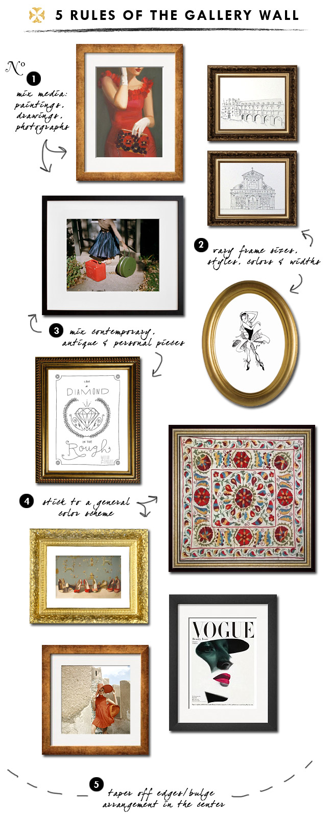
Hello awesome crew! I'm Erika from small shop, excited to share with you some thoughts on how to construct a gallery wall. Having done a few of these, I didn't even realize I had a few unspoken rules in the back of my mind. And since Tobe is moving into a new pad with lots of empty walls, perhaps some of these tips will come in handy (although I don't think she'll need any help in that department!)....

No.1: Definitely choose your pieces from mixed media -- illustrations, paintings, photographs, abstracts, even textiles...the more varied, the more interesting!
No.2: Vary your frame sizes, styles, colors & widths to give the appearance that the pieces have been collected over time. Often you can find great off-the-shelf frames (sometimes with mattes included!) at your local art supply shop. Also mix in a pair of frames.
No.3: Mix contemporary, antique and personal pieces to create visual interest. Dust off your old sketchbook and see what little wonders you can find. Or frame a piece or two of your kids' art. Mixing in those personal touches with store-bought prints will make it that much more special to you.
No.4: Stick to a general color scheme. Since you'll be mixing media, frames, and styles of art, adhering to a basic color scheme will help make the arrangement visually cohesive.
No.5: Taper off at the edges/bulge at the center. You want to arrange your pieces so that they kind of coalesce at the middle. This will help define the area and make it feel like one entity.
So do you think you could tackle this task now? Not quite as daunting? I say as long as you fill it with things you love, it really doesn't matter how perfect or imperfect the layout is. It should just make you happy every time you look at it!

+ + + + + + +

all amazing tips that i will be taking into consideration in a few parts of the house, i believe.
thanks, erika, for a little insight into your flawless design sense!

house guest || mimi & meg

December 15, 2011

today's house guest is another real life house guest from time to time, the ever stylish megan of mimi+meg. at least, she was before her big move to D.C.! megan is basically the epitome of style, and i'm beyond happy to have her hooking me up with some fitting picks for the new house!

+ + + + + + +

Since Tobe is going to be decorating her new home, I thought I'd put together some decor items that remind me of her!


1 || 2 || 3 || 4 || 5 || 6 || 7

+ + + + + + +

eerie how well you know me, meg. i would eat every single one of those items up in a second.
especially those lamps!

house guest || ampersand design studio

December 14, 2011

this week's guesters are actually occasional real life guesters! i'm excited to introduce you to design super talents morgan and carrie of ampersand design studio. i had the pleasure of working with this design duo for several years and i have to say, these girls got skillz. as friendly as they are talented and stylish, you'll be hooked after one visit to their little corner of the web, i promise!

+ + + + + + +

Hi everyone! It's Morgan & Carrie from Ampersand Design Studio and we are totally thrilled to be guest-posting on Because It's Awesome for our dear friend, Tobe! As you all know, Tobe is in the midst of a big move to a new house, so we thought it would be fun to round up some fun ways to turn any new house into a home! We think it's about surrounding yourself with things that are uniquely yours and that make you happy every time you walk in the door. We searched high and low for some old favorites and brand new inspiration:

 Displaying art, curiosities, photos of loved ones and books that you have collected over time.

Finding a cool way to tie in one of your intials. (We thought this would be a great one for Tobe since she is typography-obsessed.) 

We always feel like we're in a "home" when there are personalized accents!

Another way to make things personal is to keep a map of your travels! We both have always wanted to do this but never took the time to search for a really cool one....until now! Isn't this great?!
And what other way to truly own your new digits (address digits, that is) than custom mailing labels?
 And customizing your front door with new address numbers! (and a cute bike parked out from wouldn't hurt either)

Thanks so much, Tobe, for hosting us here on your blog! We can't wait until you host girls' dinner so we can see the new digs! (even if we're sitting on the dining room floor for starters). Congrats again on your new house!

+ + + + + + +

thanks, girls! can't wait to furnish this beast so we can resume girls night. ox

house guest || savvy home

December 13, 2011

visiting today is the very chic gabrielle from savvy home. if you've ever visited her blog (and i think you should), you will know why i don't miss a post. she very simply has the best eye for amazing spaces (you know, the ones that you stare at so you can dissect every last detail. every. time.) and she curates a mean round up. quite thrilled to have her stop by BIA with her fabulousness!

+ + + + + + +

Hello fellow Awesomites, Gabrielle from Savvy Home here. I was over the moon when Tobe asked me to fill in while she's settling into her new home. Moving is always exciting, but it's also a truckload of work!

We settled into our house about a year ago with NADA. Decorating has definitely been a process. One that is still in motion! Starting with a blank canvas can be hard, so I thought I'd help Tobe by sharing a few tips and giving her some ideas for her new house.

 (please excuse my poor typography skills!)
1. Find inspiration: In Tobe's case, this was easy. Her blog is filled to the brim with beautiful interiors.

2. Find the common thread in the inspiration images: there's always a few common threads between the inspiration images. Compile a list of things that appear in more than one (see left).

3. Consider space and budget. Invest in good-quality larger items like sofas. Make sure they are timeless and will last you a lifetime. Allow yourself to splurge on 1-2 items you absolutely couldn't live without. They will set the tone for your home. Accessories can often be found on a budget and can be swapped easily.

4. Here comes the fun part: sourcing materials (more casually known as shopping)! I always work from the ground up. Rugs and large furniture first, then paint or wallpaper. It's easier to match paint to a rug than the other way around. Then comes smaller accessories, lighting, art, etc.

Here's what I came up with for Tobe. The best part is that all the accessories are under $200! Art can be mixed high and low (from original to prints) and arranged into a gallery wall.

 Paint

Rugs

Furniture

Accessories
Under $100

Under $200

Art 

Thanks for having me Tobe. Hope you are settling well into your new home!


+ + + + + + +

i don't know . . . that board doesn't look anything like my style.
except that it looks an awful lot like the family room i've been dreaming up!
gab, you've done it again. many thanks for stopping by!

the new diggs

December 12, 2011

finally, right? today i'm super excited (and only a little bit nervous) to finally show some pics of the new house! i snapped these the day of inspections, so there's some misc equipment here and there, and i only took them to fill the gaps of what we already had from the listing photos, so it's not an extensive tour, but you can at least get a sense of what we're workin with . . .

first, the formal living room:


which is open to the kitchen (where i'm standing for these shots) and on the opposite side of the entry from the family room:


the room just past it with the drapes is the formal dining, which takes you right back around to the kitchen:


and just for kicks (and because it's apparently award-winning), the master bath:


and a peek at the backyard:


all those leaves are still there.

there you have it, party people. it is absolutely not a bit what i was expecting to buy. we'd been shopping the late 70s/early 80s fixers with a vengeance. so many that had amazing potential, but needed lots of cosmetic love. the moment i saw the listing for this beauty, i said, why not? maybe someone in this city didn't choose completely vanilla upgrades and we can have that older home with gobs of charm and a price tag we can afford? and so it was.

half of those spaces are still totally empty. there's a bit of furnishing to do. and it is not without existing cosmetic elements i'd like to change (i must note that, overall, i'm quite happy). all of which, naturally, you'll be subjected to, likely even complete with solicitations for your ever-awesome advice. i already have a million ideas swirling around in my head! it's going to be
so.
much.
fun.

more amazing guesters this week while i continue to dismantle boxes for a few more days.
i tell you, they multiply.
Related Posts Plugin for WordPress, Blogger...
 

© Because It's Awesome All rights reserved . Design by Blog Milk Powered by Blogger