interiors || oh, Kelly

July 29, 2011

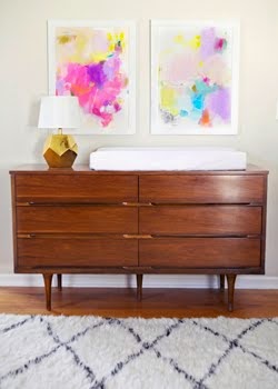
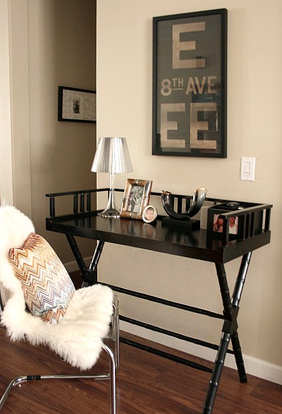
no, fridays are not all about bars and drinks, contrary to how many times in a row i might post them. however, this friday will include bars. well, kelly wearstler bars. which, let's be honest, you would appreciate just for the aesthetics. have some champagne or have some soda water. either way, you'll be happy to be there.

and if you hate her style, humor me. i can't believe you read this blog anyway if that's the case, because that probably means you hate my style, too.

and clearly you don't, because you're here, aren't you?

behold:


i threw in some non-bars, but i didn't like doing it.

either the woman likes to do yellow, or i just like the woman when she does yellow.


happy champagne (or soda water) friday!

interiors || what if . . .

July 27, 2011

what if you had windows like this . . .


and a bookshelf like this?


(i would let you have a taller ladder)


are you like me? i would never leave. ever.

images via casa tres chic

artist || miranda skoczek

miranda's work is colorful, complex, imaginative and an utterly delightful play on global influences.

 the young and colorful doe

 among my swan

 the exuberant and lavish

 black and white arrangements

 air fire water

the beautiful and the good #4  ||  images via miranda skoczek

fashionista || DVF pre-fall

July 26, 2011

now, i know it's still ridiculously hot out there . . . still, i couldn't help but fall victim to the DVF pre-fall line on shopbop.


 view the whole line on shopbop

can you tell i tend to be a solids kind of girl?

type tuesday || men in type

easily the coolest ad campaign for dockers i've ever seen.


interiors || marrakesh heaven

July 25, 2011

i can barely handle this place. another one for my must visit list.

wait. are you sitting down?


images (and information about the palace!) via in a state of luxe

the i am project :: love thy neighbor

The I Am Project on Facebook || Etsy Shop

 The I Am Project :: Our wish is to affirm and inspire the beauty in every woman, to celebrate the uniqueness in each of us, as well as the commonalities that unite us as women. We want to create a space to confront the dark places that come with growth; to witness women being valued for more than their bodies, clothes, or societal projections; to feel inspired by stories and images; and to become more deeply rooted in who we are as women. We want to become a net of resources that will nurture and fortify each other's confidence, and fill women with awareness of the extraordinary beauty that each of us uniquely brings to the world.

Questions, thoughts or feedback about The I Am Series? Send them to iamproject.us@gmail.com. We would love to hear from you!

We welcome you to repost and/or share these images if you wish! We also respectfully request that you credit and, preferably, link back to Because It's Awesome as you do so. It's easy to do, and it's good blogger practice. Many thanks!

champagne friday

July 22, 2011

it's friday! that usually warrants dancing on tables . . . even if it's at home alone in your pajamas.


1  ||  2

interiors || lonny magazine

July 21, 2011

okay, so you've surely already seen these lonny features. but i can't not post them. i mean, when i look back at this blog months or years from now, i'll want to be reminded of these amazing spaces. and how i had good enough taste to appreciate them :)

not that you're obligated to like them. but if you do, perhaps you'd like to tell me your favorite aspects?

first up, the delicious chicago apartment of lauren gold, design director for nate berkus associates


images via lonny magazine, photos by patrick cline

the past few issues have featured this glam look with metallics and black and warm whites, and i'm completely okay with it. favorite parts: the blackout open shelving, that sic chrome lamp, the mixed metals and that dining table 
paired with those chairs (duh).

and then there's ruthie sommers' living room. i died a thousand times when i saw this spread.


ruthie sommers in lonny magazine, photos by patrick cline

i really can't handle the sheer genius of this place. i've come to hate the overused term "eclectic" in the last few years, but this living room is style-that-shall-not-be-named done exactly right. it's pecuuuuuliar, and i couldn't be more in love. i love that every element is amazing on it's own, but that they can all live in such harmony. chaotic harmony. which is my MO, so i approve   >>>>>>>>>   do you?

interiors || animals in the office

July 20, 2011

probably an obvious question, but....yay or nay?


images via small shop studio  ||  flickr  ||  white wave design

fashionista || signs of summer

i'm headed to where it's even hotter. nothing like getting in the spirit . . .


images for cosmopolitan russia july/august issue  ||  via oracle fox

naturally, i have all of these outfits packed.
Related Posts Plugin for WordPress, Blogger...
 

© Because It's Awesome All rights reserved . Design by Blog Milk Powered by Blogger