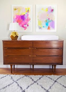
Heidi Merrick via Glitter Guide
Stylish, comfortable, simple, relaxed and not overtly feminine, although there are plenty of girly elements. Truth be told, this is something I've struggled with as I've decorated our home. I shy away from uber feminine looks because I don't want Eric to feel like he's living in an overstyled vagina. But without a few feminine elements, you have yourself a very cold and unapproachable space, and no one wants that either. Quite the balancing act really.
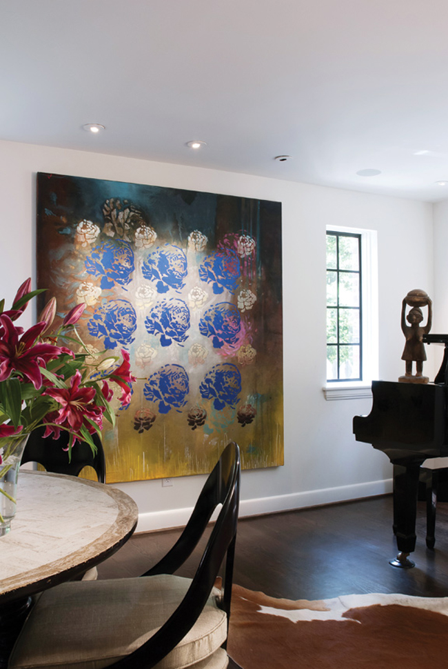
Heidi's space reminded me of this bit more masculine one, which I've never been able to get quite enough of either.
I'm probably just overthinking the whole thing. Fuchsia flowers seem to go a long way.


14 comments:
I love, love her home...and her style. Its funny I bought a dress of hers like 7 years ago just when she was starting...who knew she would get so big!
It's gorgeous! She has amazing style. I love all the huge windows.
Her house = my dream. I can't figure out that balance either!
i love both of these homes. i have no idea where they are located, but they both seem to have a California vibe (maybe it is the crisp white?)i can only dream of! i am esp. drawn to the black windows and doors in the 2nd home. they both make it all look so effortless!
Our last place had so much color. Dark grey, coral, mint... but I am drawn more and more towards white walls. So pretty and airy. xo
heidi merrick's home might be one of my favorite home tours EVER to exist.
I love the white walls with bold color additions. That old bookshelf is gorgeous!
Yes! Love the white walls and gorgeous rugs!
I live with 3 males and this summer we have embraced fushia in our home. The boys have all survived !!! Loving the energy that pops of pink bring to any space . So I say just do it . You will love it
i love it's happy simplicity. plus i'm always a fan of white interiors with shots of interchangeable color.
"I don't want Eric to feel like he's living in an overstyled vagina." HAHAHA!!! Oh that made me laugh!! Love it!
Agree it's so hard to get the balance right - the longer we've lived here, the more feminine the house has become! Funny thing is, Wayne does actually like the brighter, more colourful palette so he seems okay with a few touches of pink and turquoise. That first place is so beautifully eclectic, thanks for sharing it, I've never seen the whole space in it's entirety either! xxx
I'm struggling with the same dilemma in my house...perfect balances of fem./masc., scale, texture, while ALSO making it livable for a family. Shit is hard. And EXPENSIVE.;)
Right... I need fuschia flowers now!!
This house is AMAZING! That dining table setup is absolutely perfect.
Post a Comment