+ + + + + + +
Hello awesome crew! I'm Erika from small shop, excited to share with you some thoughts on how to construct a gallery wall. Having done a few of these, I didn't even realize I had a few unspoken rules in the back of my mind. And since Tobe is moving into a new pad with lots of empty walls, perhaps some of these tips will come in handy (although I don't think she'll need any help in that department!)....

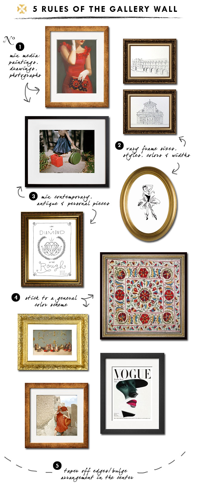
"Pruduence" by Janet Hill, $44 // travel sketches notecards, set of 8 $24
"Untitled 6" by Jessica Bruah, $50 // "Ballet Print" by Calla O'Malley, $10
"Diamond in the Rough" by I Am Project, $18 // Suzani wall hanging, $110
"Dancers" by Janet Hill, $24 // Vogue Cover, May 1945 $125
Vogue, December 1967 $139 (All prices unframed)
No.1: Definitely choose your pieces from mixed media -- illustrations, paintings, photographs, abstracts, even textiles...the more varied, the more interesting!
No.2: Vary your frame sizes, styles, colors & widths to give the appearance that the pieces have been collected over time. Often you can find great off-the-shelf frames (sometimes with mattes included!) at your local art supply shop. Also mix in a pair of frames.
No.3: Mix contemporary, antique and personal pieces to create visual interest. Dust off your old sketchbook and see what little wonders you can find. Or frame a piece or two of your kids' art. Mixing in those personal touches with store-bought prints will make it that much more special to you.
No.4: Stick to a general color scheme. Since you'll be mixing media, frames, and styles of art, adhering to a basic color scheme will help make the arrangement visually cohesive.
No.5: Taper off at the edges/bulge at the center. You want to arrange your pieces so that they kind of coalesce at the middle. This will help define the area and make it feel like one entity.
So do you think you could tackle this task now? Not quite as daunting? I say as long as you fill it with things you love, it really doesn't matter how perfect or imperfect the layout is. It should just make you happy every time you look at it!

+ + + + + + +
all amazing tips that i will be taking into consideration in a few parts of the house, i believe.
thanks, erika, for a little insight into your flawless design sense!

Great tips, Erika! I'm especially loving the I Am Project shoutout... :)
ReplyDeleteThanks for having me Tobe, and for the fantastic intro! I've been having a rough month, so this really perked me up, you have no idea!
ReplyDeleteThanks for this I'm never quite sure how to go about doing this. x
ReplyDeleteI for sure learned a thing or two. I feel like I should change out my gallery wall.
ReplyDeleteI loved this post. As we begin redecorating our apartment, this is great advice. I too, am hopelessly devoted to Erika's blog - it's one of my favorites!!
ReplyDeleteHey there! I just found you through Erika. Great blog. Erika also just did a guest post for me. Let me know if you'd be interested as well. Can't wait to see more of your new home as it comes along.
ReplyDeleteLove Erika's blog. This is such a great post, amazing tips!
ReplyDeleteAnother fantastic post from Erika!! Thanks Tobe for sharing Erika with us on your blog. I could definitely see more posts like this one!
ReplyDeleteErika is just brilliant :)
ReplyDeleteFound you via small shop and am now following!
fashiontruffles.blogspot.com
I love this post! Erika is amazing and this is so helpful. Thanks Tobe! xo
ReplyDeleteAwesome, I was planning on doing this for my office area, good thing I have the dos and donts before hand! xo
ReplyDelete