March 29, 2012

interiors // it speaks to me

thank you guys so much for your sweet comments on our first girls dinner post! it was so thrilling to receive such an enthusiastic response, and we're really excited to bring you more installments of our girly feasts!

as for today, we're talking about this here entryway

nov 2010 veranda // gil schafer, architect // miles redd, decorator  // via the foo dog ate my homework

i think that rug wants to be in my entry right now.
or possibly in the dining room under my new antique table amidst perfectly whitewashed walls.

March 28, 2012

girls dinner // pizza party

i'm really excited to introduce a new series on BIA today. we're talking dinner!


now, i realize that i have not once implied here on BIA that i can do anything in the kitchen (besides maybe make salsa). that's because i'm not especially skilled in that department. but that's always been the beauty of our girls dinners! they're low-key, festive but not excessively prepped, and just straight fun. of course, it doesn't hurt that they're held by a multitude of talented designers including the ladies from ampersand design studio, the ever-crafty laura at a girl who makes, and yours truly.

for the first of this new series, we're having a pizza party! here's a glimpse of how it all went down:

lettered placesettings.
you can get clever with this or keep it simple. opting for a unique or decorative paper stock goes a long way!


results:


delicious apps (essential!)


assortment of equally delicious salad and pies:


time to play!


and, even though we were totally full of great food and good wine, there's always room for gelato!

photography by eric linebarger

here's how to get the same look yourself:


check out ampersand design studio for a detailed polka dot napkin DIY and a custom coordinating invite!
you can also find a great DIY leftover bag over at a girl who makes.

March 27, 2012

type tuesday // type fight

i'm loving the spirit and competition of these letter battles hosted by drew roper and ryan paule.


every week or so, these find gentlemen pit two artists against each other. occasionally even themselves.


readers get all the say in whose the better letterer.


pretty fun, right?


if you love letters, you may want to keep your eye on this site, rich in inspiration.

images via type fight

March 26, 2012

the house // G's desk

happy monday, all! i hope many of you had the same gorgeous weekend we were lucky enough to bask in. eric and i spent most of saturday cleaning up the yard and enjoying our furniture-less patio (given how amazing it is to have a backyard after years in a loft, patio wares now trump any other furniture i may have been eyeballing). in fact, much of yesterday involved scouring local furniture stores and the intranets for something suitable.

yet again, we learn that i have expensive taste.

lucky for me, g's desk is one thing that didn't come at a high price. and, ironically, it was exactly what i was hoping to find! side table, desk and vanity all in one.


not in perfect condition, but i tend to like that. i plan to paint the lamp base and might replace the chair with a victoria ghost chair. also still scouring the web constantly for a great poster bed . . . what we end up with will largely determine the bedding.

as always, things are slooooooowly coming along.

March 24, 2012

interiors // favoring white

there must be some severe shift in the planetary alignment or something because i've been favoring white as of late. which is not unheard of as far as spaces i'm occasionally drawn to . . . but it's really something i never consider for my own home.

this got the whole thing started:

design by laura day, photography by patrick cline // lonny magazine

because the chairs and those mirrors don't hurt anything either.

my dining room and office are begging for it.
any warm whites i need to know about?

March 23, 2012

interiors // right down to the rug

i don't know how i haven't seen this home before - loving this space on so many levels!


design by wendy schwartz // via rue magazine

March 22, 2012

interiors // wax factory gone graceful home

this stunning home belongs to the inspiring isabel lopez-quesada, whose delicious portfolio i could feature for a week straight.


design by isabel lopez-quesada, photography by simon watson // via architecural digest

March 21, 2012

perfect package // luxury pooper scooper

hilarious.
i'd totally buy it.


does it make you want to be more responsible?

March 20, 2012

type tuesday // vermandois

can't lie, this font absolutely makes my heart skip a beat!


couldn't even tell it was a font, could you?
get it via myfonts.

March 19, 2012

the house // monday sneak peek

g's room is coming right along . . .


the color is martha stewart kalamata olive, and it is pure gloriousness.
it looks sort of blue in the bottom picture; the first is more accurate.

remember my inspiration? we're still in need of many things
- four poster bedframe
- bedding (that she hasn't been using since she was 6)
- side table
- second suitable lamp
- seating
- dresser
- art
- possibly ceiling paint

you know, not much. just a few things...

March 16, 2012

interiors // feeling lucky

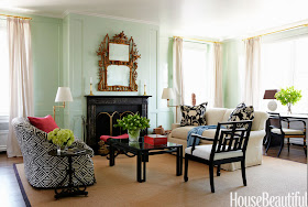
as i perused my archives for st. patty's day inspired goods, it became wildly apparent that i am not a huge fan of green in my interiors. unless it's mint green, which i seem to be okay with . . .


except there's this one, which incorporates both emerald and minty goodness

hutton wilkinson's home via harpers bazaar, photographed by christopher sturman

and this one, i would actually wear as well (assuming someone gave me a load of cash to waste spend). so you know i like it.


hope your weekend is full of rainbows and gold!